Open gallery
In past weeks we have done some further testings of augmented reality. One of the issues we have noticed during our tests, is the quantity and relevance of the information on the screen in combination with readability.
 Especially in the sun, quantity of information might become extremly unuseful. Result is many small, as well as many visible improvements to augmented reality mode in ARTOUR.
Less is more in augmented reality
When using augmented reality mode, users are most of the time focused on something they want to check out. Therefore, exposing single location of point of interest might be the only information needed, with some small information added (title, distance, short description).
Text size should be dynamic

Depending on the distance to the point of interest and the relevance, text size or other visual elements should vary in size. Increasing the size as the user approaches the point is sending important message to user that he is nearing the point, without looking at exact distance.
Limiting the number of points visible at any moment
Sometimes, within the same angle, there are many points of interest. For example, if user is standing few kilometres from the points, there may be 10 or 20 points that should fit the screen. It is important that we limit the presentation of these points on the screen by their relevance (distance or other filter), otherwise user may be confused what he is looking at.
What ARTOUR does
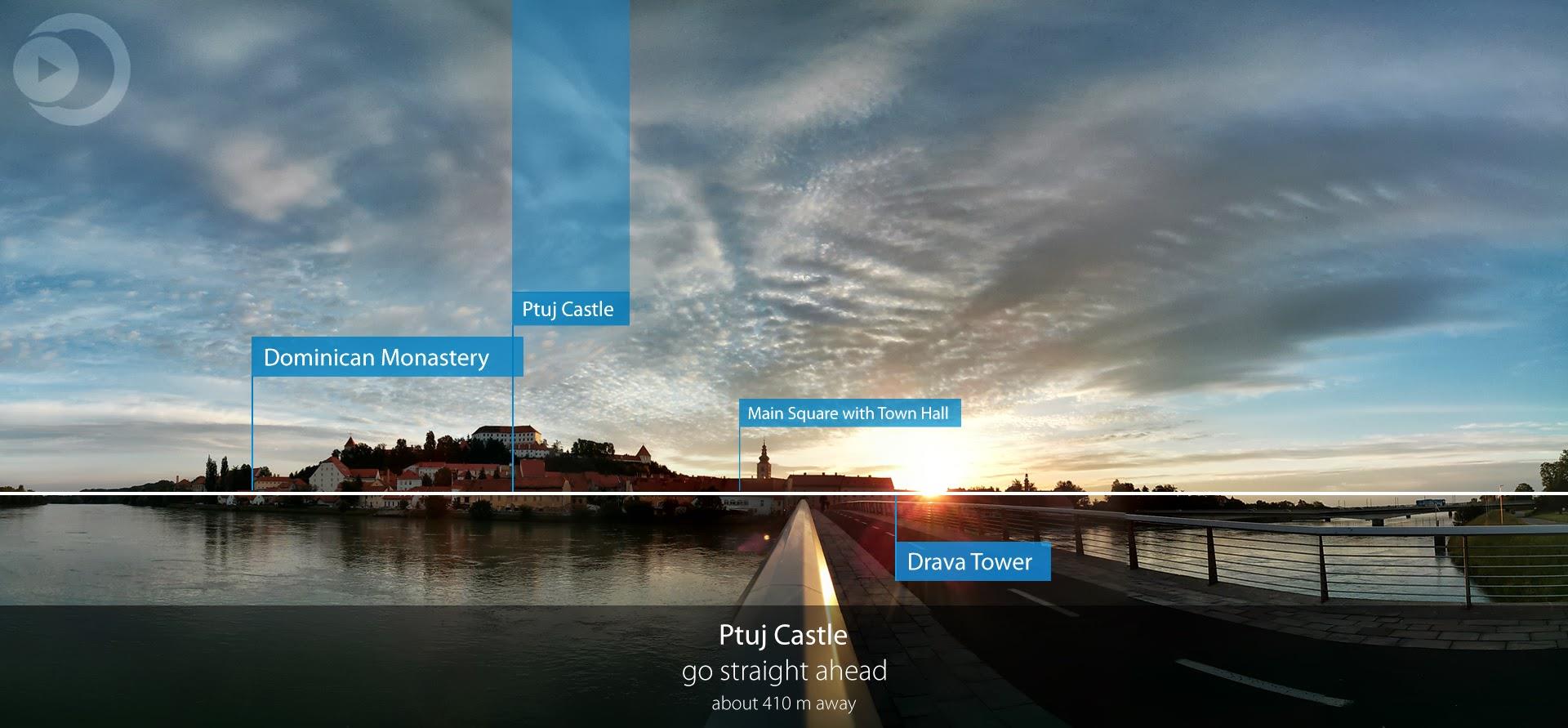
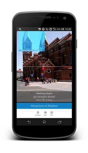
These are the details that ARTOUR now takes care of in Augmented Reality mode. By providing only relevant information, dynamically changing the size and amount and moving guiding information to the bottom of the screen.